As engineers and planners, we’re tasked with shaping the transportation systems that power our communities. We strive for safety, efficiency, and sustainability – all with the goal of creating lasting value. But achieving those goals requires more than just technical expertise. We need to effectively communicate with the public, listening to their concerns and clearly conveying our ideas and solutions.
Too often, though, we fall back on the same communication methods we use with our colleagues: technical jargon, complex tables, and detailed plans or cross sections. This approach can leave the public feeling confused, uncertain, and even fearful. Recent research suggests that even domain experts and decision makers have trouble with complex data visualization. How can we expect them to support projects they don’t fully understand?
I’m convinced that the answer lies in embracing clear, three-dimensional (3D) visualization. By presenting proposals in a way that’s both easy to understand and relatable, we can build public trust and pave the way for successful project implementation. 3D visualization isn’t new, of course; it’s been a proven communication tool for years, giving people a tangible sense of how a project will look in the real world.
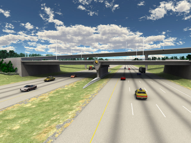
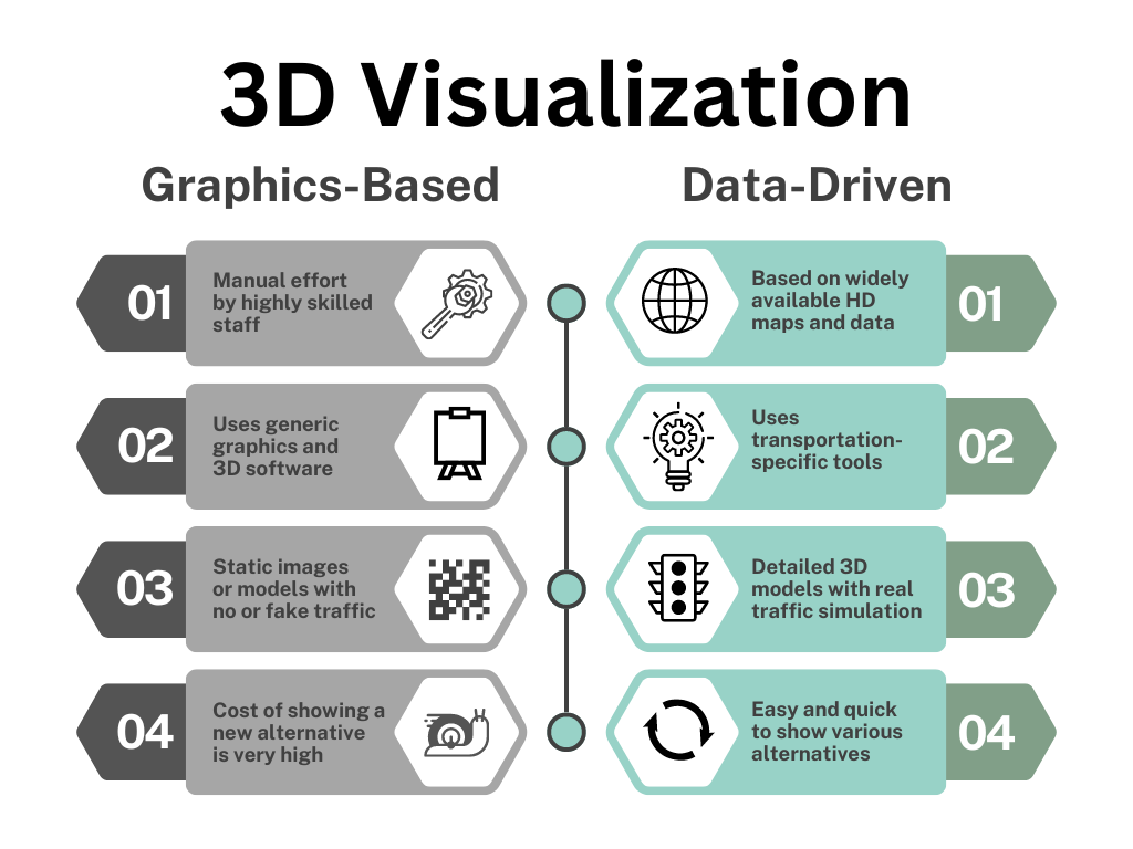
But here’s the exciting part: we’re at a turning point in visualization technology. What used to be a time-consuming, manual process requiring specialized skills on generic graphics software is now becoming much more data-driven and compatible with transportation-specific software. This shift opens up a world of possibilities. We can create 3D visualizations earlier in the planning process, showcase more alternatives, and communicate not just how a project will look, but also how it will function.
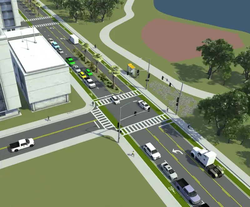
Check out the example below of a hypothetical project in Downtown Orlando. This proof-of-concept animation showcases how Rosalind Avenue would look and function as a two-way street instead of its current one-way configuration. Although the project isn’t real, the traffic shown in the animation follows the rules of the road and behaviors commonly used in traffic simulation.
By harnessing this new data-driven approach to 3D visualization, the industry will transform the way we communicate transportation projects. We can empower the public to see, understand, collaborate, and ultimately be a partner in building a better transportation future.
Give your next proposal or project presentation an edge
We can help you communicate your ideas through visualization